Temitayo Alamu crafted an identity for Inverted Blackness, a gallery initiative dedicated to reframing how Black identity is perceived and presented. The result is a modular, rotating system that evolves with each use—stretching and shifting to reflect the layered, fluid, and multifaceted nature of the stories it holds.
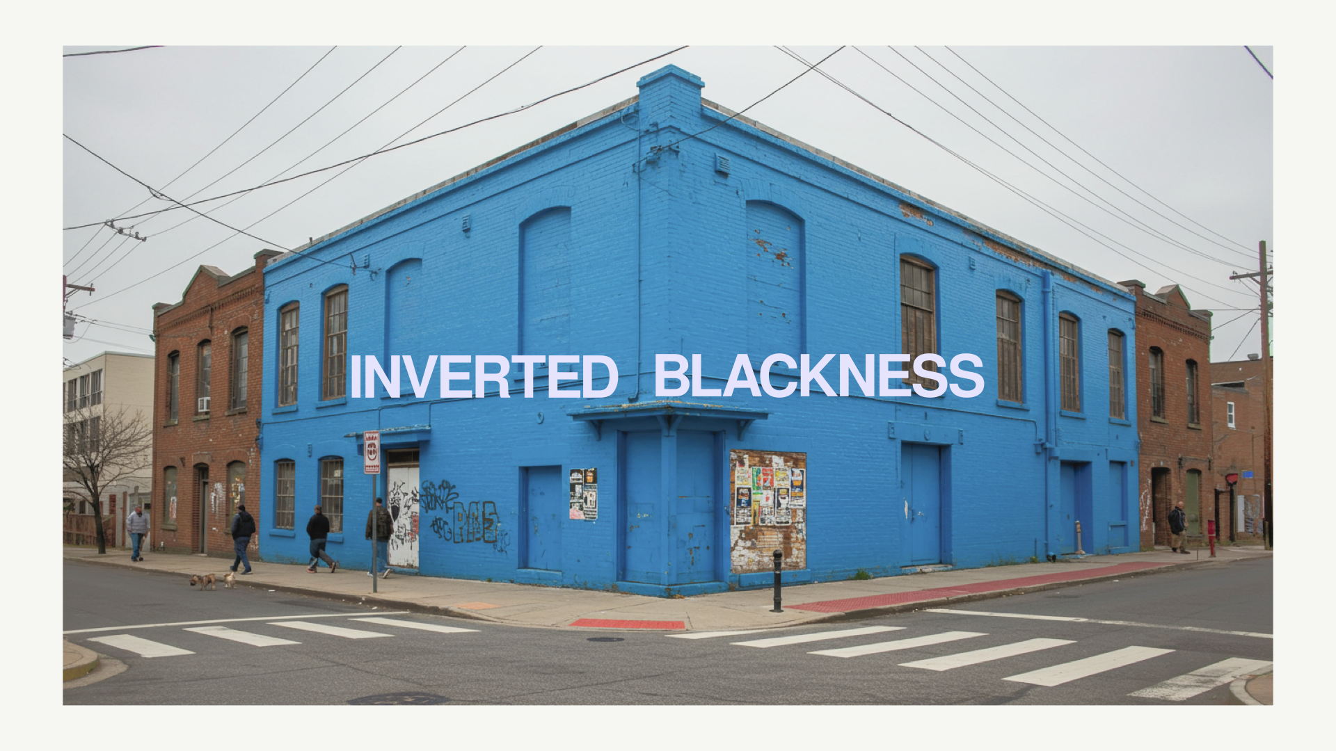
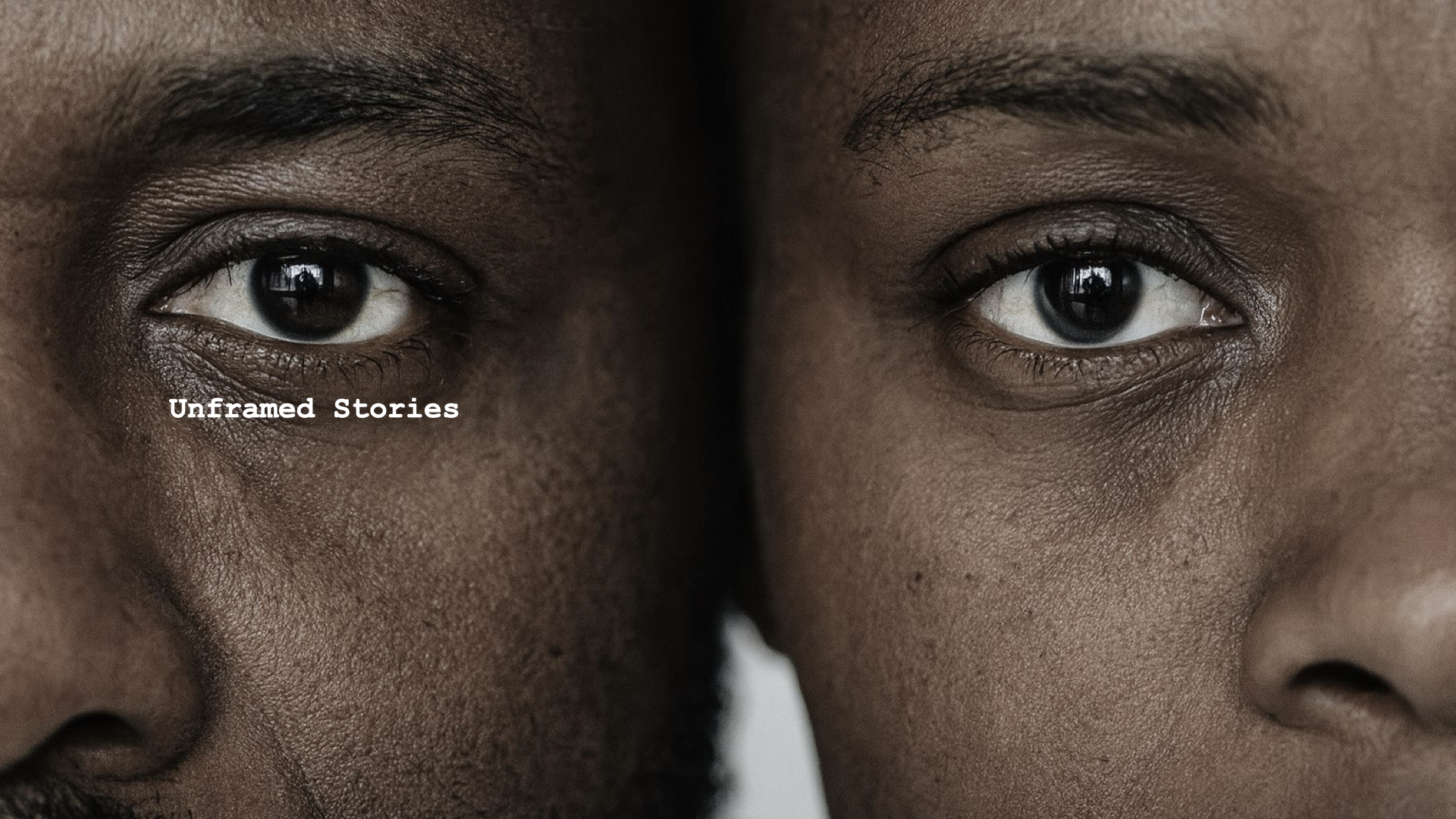
Inverted Blackness is a gallery initiative dedicated to reframing how Black identity is perceived and presented. Through photography, storytelling, and visual inversion, it challenges societal narratives by encouraging viewers to see Blackness not as fixed or monolithic, but as layered, fluid, and full of contradictions.
According to Temitayo, "the brief called for a mark that could evolve with the stories it represents, with the goal of developing an identity that could hold space for the stories complexity of—a system that felt alive, flexible, and grounded in perspective."
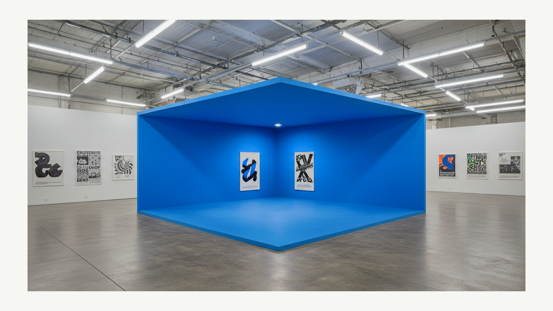
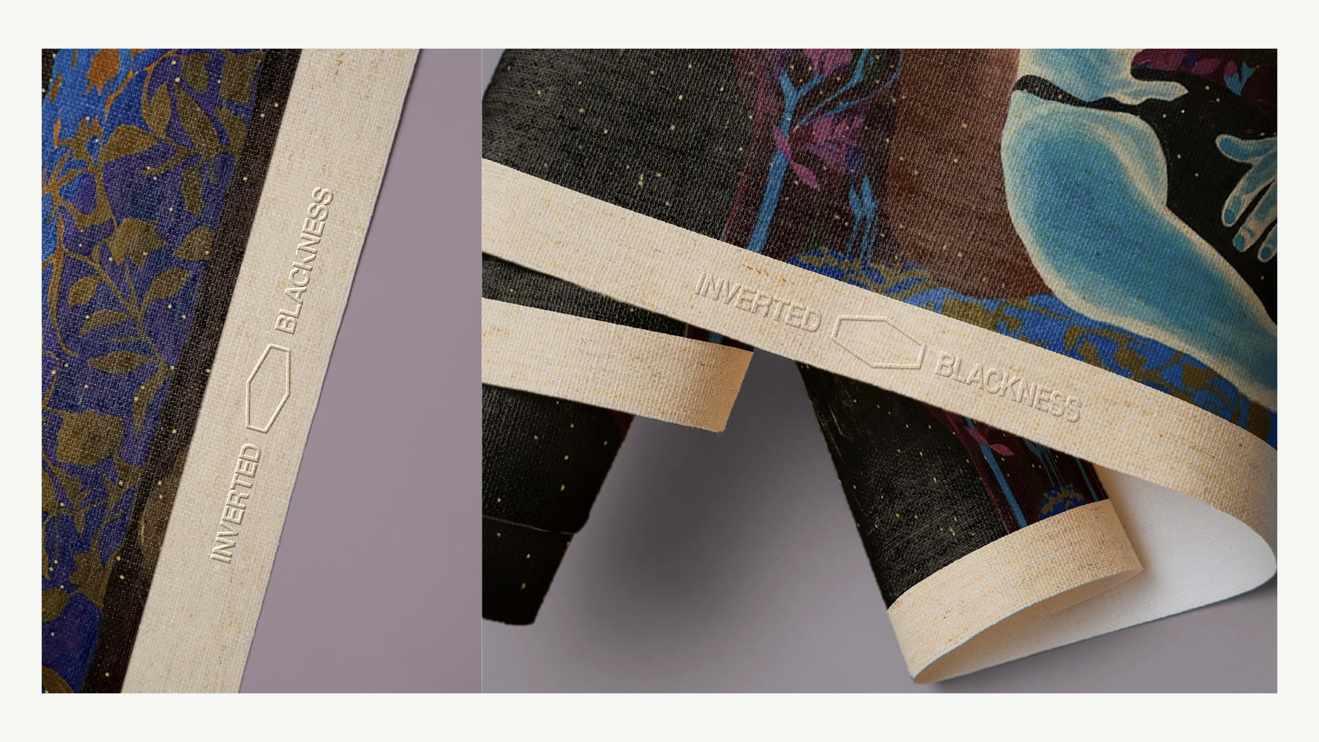
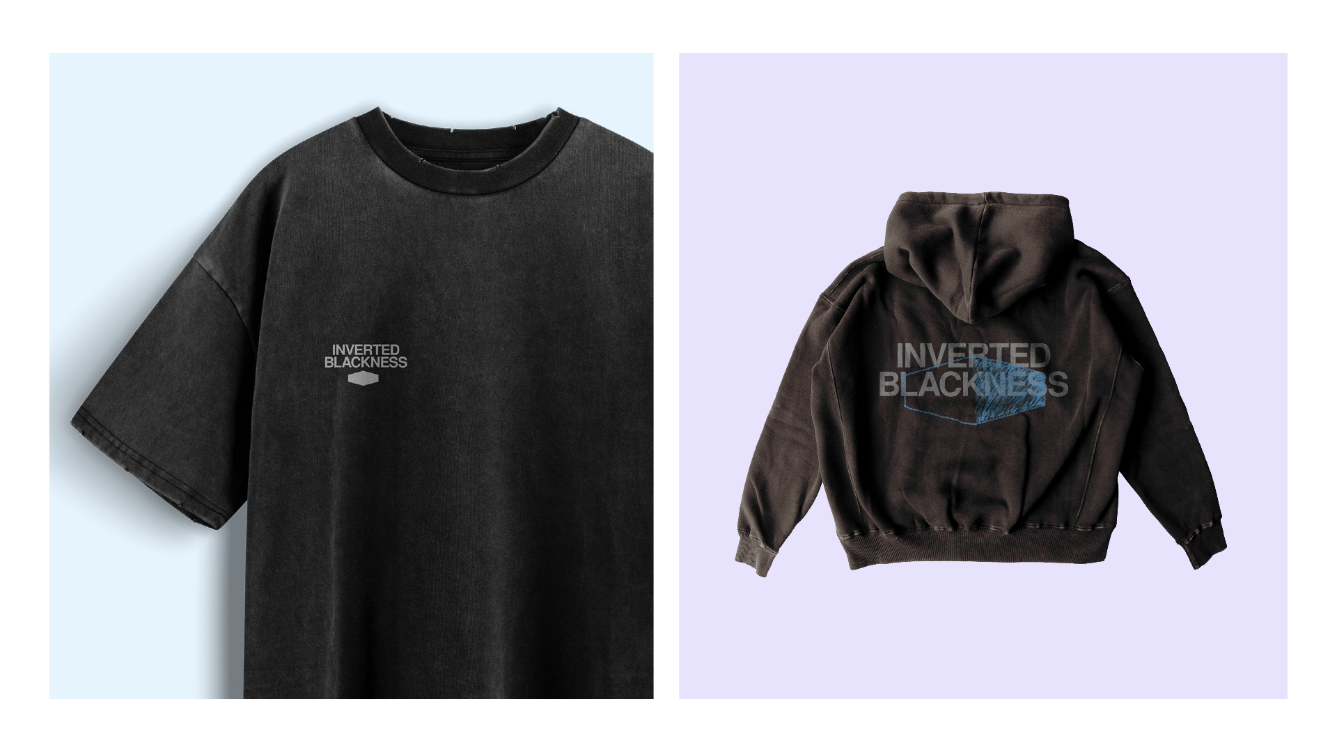
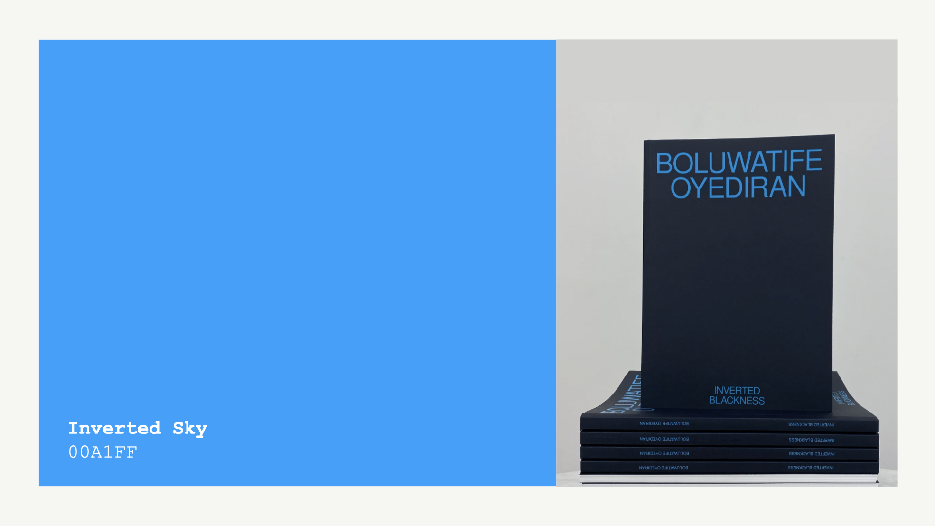
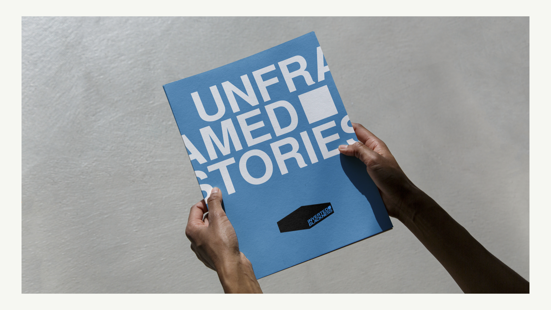
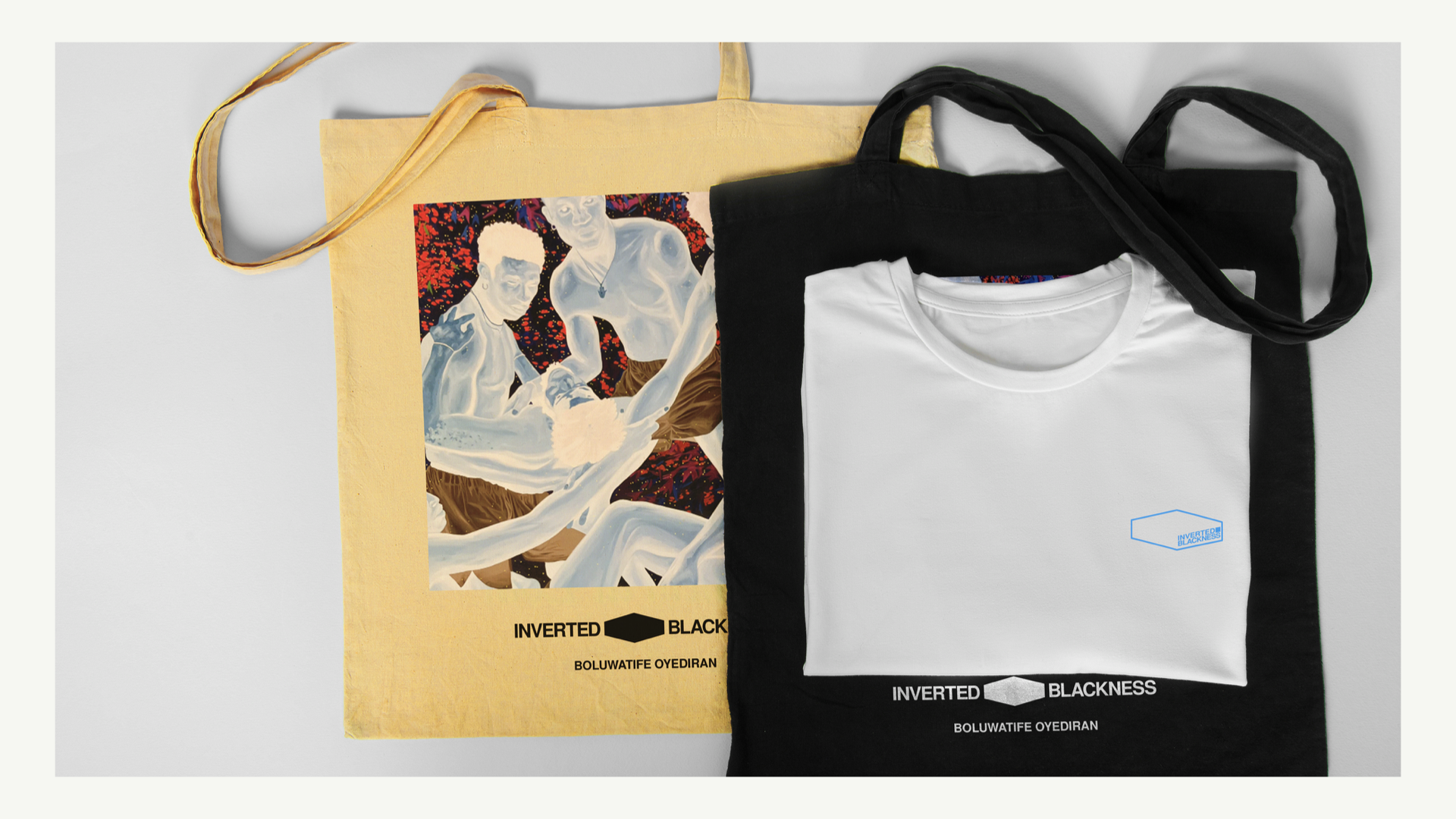
With the project spanning across research, conceptual development, visual identity, motion design, and applications across apparel, gallery installations, and digital touchpoints. The result was a living visual system the reflects the project’s core principle, "to un-frame the narrative and invite multiplicity".
Temitayo began the creative process with a deep exploration of what “inverted Blackness” could mean beyond visuals, emotionally, politically, and culturally. He approached the project as a narrative system, stating, “We developed the conceptual direction ‘Unframed Stories,’ a theme centered on shifting perspectives and resisting the confinement of identity within imposed boundaries.”
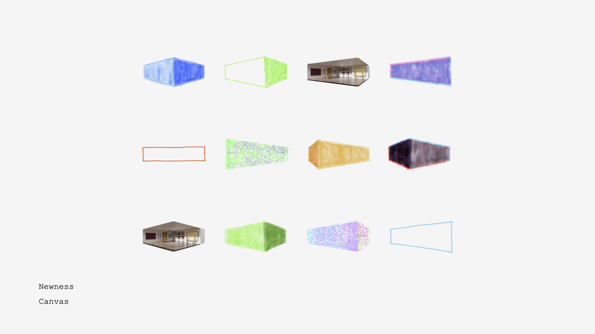
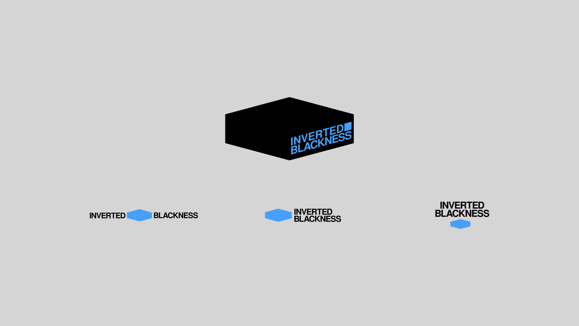
Central to this idea was the metaphor of the frame-as-box as both a limitation and a container. From this, Temitayo created a three-dimensional hexagonal mark that could appear static or dynamic depending on the viewer’s perspective. Typography and color (a striking Cerulean Blue) were selected to convey emotional clarity and reinforce the concept of visual inversion. “We paid special attention to how color shifts could mirror the project's themes,” Temitayo noted.
Collaborators were invited to contribute alternate logo interpretations, forming a modular, rotating identity system that evolves with each use. The final output is not a fixed symbol, but a living identity that can stretch and shift alongside the stories it represents.